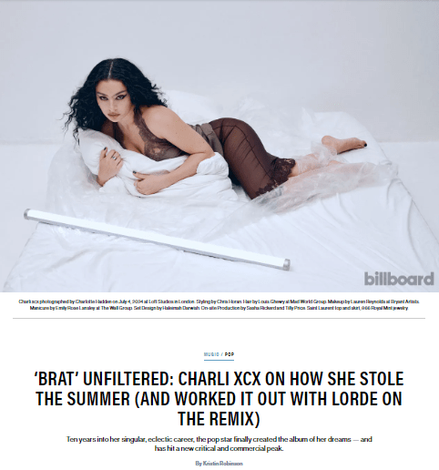
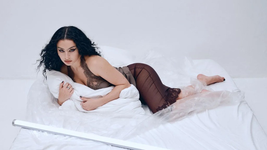
Ten years into her singular, eclectic career, the pop star finally created the album of her dreams — and has hit a new critical and commercial peak.
By Kristin Robinson
Now I swear this green is just everywhere,” Charli xcx jokes. The British pop star is sitting in a crisp leather seat within a black Mercedes-Benz van, a few minutes into the long journey across London from her home to Wembley Arena. Tonight, Charli will be making a surprise appearance at her friend, collaborator and soon-to-be tourmate Troye Sivan’s late-June concert there — but right now, she’s focused on the neon green hue of both the tissue box across the seat from her and my laptop case. Outside, I spot a car of the same color passing by, then a man in a neon green construction vest. Has this color always been so prominent, or are we only just now noticing it?
Inspired by a 1990s neon rave flyer and the title credits to Gregg Araki’s 2007 comedy, Smiley Face, Charli, 31, calls the album art’s color “actually quite disgusting” and says she picked it because it “spark[s] a really interesting conversation about [desirability]… It had to be really unfriendly and uncool.” Its shocking shade (it’s Pantone 3570-C, by the way) and easily replicable format has spawned mass virality — even the LinkedIn business bros, far from her target audience, are heralding it as “genius marketing.”
It’s hard to overstate brat’s current chokehold on the culture at large. “Bestie got a parking ticket and it’s BRAT CODED,” one fan recently tweeted, along with a photo of a green-colored citation. Hangers, earrings, lice shampoo, T-shirts, laundry detergent, olive oil, traffic signs, some old lady, grocery store chain Publix — if any trace of that characteristic green is involved, it can, and will, be labeled “brat” and posted online. Major brands like Amazon, Duolingo, Google and Netflix have embraced the hype, making “brat” memes of their own. Vegan sausage company Field Roast even created ads with lime green packaging featuring the word “bratwurst” in Arial font.
It’s the type of craze any marketing guru would kill for — which is why it’s even more noteworthy that, according to Charli’s team, the brat-uration of the internet started naturally. In fact, Imogene Strauss, her longtime creative director, has a more old-fashioned explanation for the cover art: She and Charli felt it was “loud” enough to stand out in a record store.
“We did hundreds of versions of the cover,” Strauss explains. “We knew it was going to be green, but the conversations around the shade of green were weeks long… There’s so many versions that existed before the final. We analyzed every single element: where has this color been used before, what are its associations, who reacts to it and how.”
As it caught on, Charli’s team rushed to create a “brat generator” for fans to more easily make their own art inspired by the cover. When Charli followed up the hit album three days after its release with a deluxe version — brat and it’s the same but there’s three more songs so it’s not, featuring… well, three more songs — her team built a second generator to mimic its black-and-white cover art. When a brat wall mural in Brooklyn announced the deluxe set’s release one painted letter at a time, Charli livestreamed it. As her marketing and digital guru, Terry O’Connor, puts it, a “big focus” of the campaign was about “making and creating real-life, in-person moments” that can then be captured digitally, like the phenomenon of fans posting selfies in front of the wall.
continue reading the aricle by clicking the poster below


Leave a comment